Alphabetum V
The Typotectural Suites
Richard Niessen
29.11.2019 — 23.02.2020The Typotectural Suites
Richard Niessen
Alphabetum V
The Typotectural Suites
Richard Niessen
29.11.2019 — 23.02.2020The Typotectural Suites
Richard Niessen
The Typotectural Suites
Richard Niessen
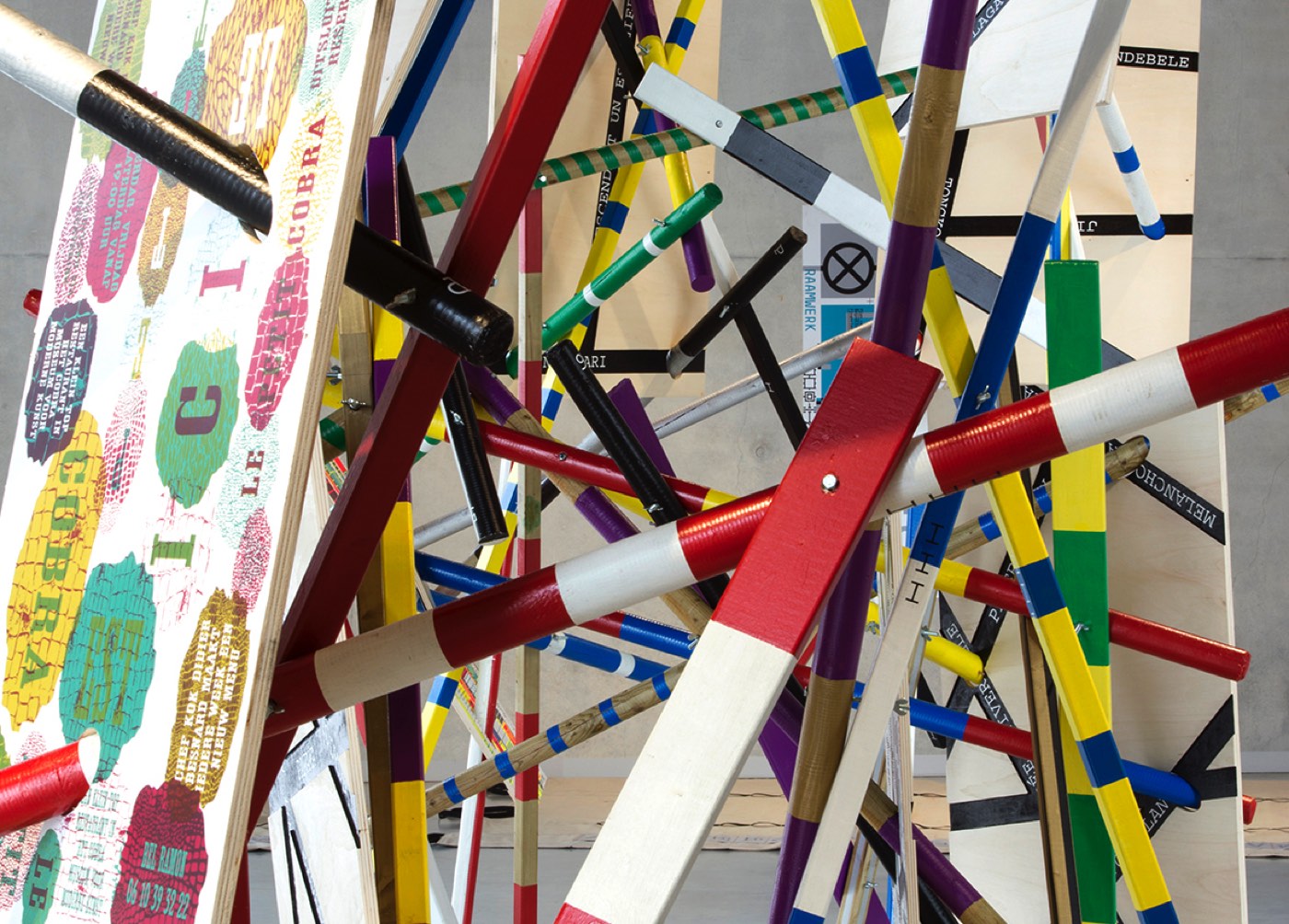
From towers built of language that become a readable city, and from letters used as a floor plan for a brick alphabet; in ‘The Typotectural Suites’ created by Richard Niessen, language solidifies into fixed structures, playful cubes and capitals on scale that are shown in a spatial library. The opening of the exhibition is also part of the new The Hague book festival ‘The Other Book’.
Architecture and typography appear to be two totally different worlds. A building takes up a three-dimensional and physical space. The writing is more modest and less prominent. Letters are used on a flat surface, in a book or often casually on a computer. Sometimes these two worlds come together, in the course of which typography obtains a more fixed shape, provides a name to a building or provides direction in the city.
In ‘Auraiceptna n-éces’ (Irish manuscript from the 12th century) the structure of language is compared with the construction of the Tower of Babel: ‘Others claim that the tower was constructed with the use of only 9 materials, being clay and water, wool and blood, wood and chalk, pitch, linen and bitumen (…), i.e. noun, pronoun, verb, adverb, participle, conjunction, preposition, interjections’. Johann David Steingruber’s architectural alphabet, published in 1773, is a reference book of very imaginative building designs based on the letters of the alphabet. Steingruber was the son of a master mason and he wanted to connect the alphabet with building constructions; his contemporary Anton Glonner developed three buildings of faith in the shape of the monogram ‘IHS’ (the first three letters of the name of Jesus in the Greek language) and a French architect called Thomas Gobert (1625-1690) wrote a manuscript in which the floor plans were formed by the words‘Louis le Grand’.
Richard Niessen (1972) also examines the role of typography in relation to various disciplines. In a playful way, he explores the borders of readability and the power of the third dimension. To him, play and imagination form the basic principles to observe how letters relate to the spaciousness. To demonstrate this, he uses, inter alia, screen print, also known as serigraphy, a graphic technique with which ink is pushed through a gauze cloth. His beautiful, colourful posters and expressive typography are often created in cooperation with other artists.
In this coordinating project called ‘Palace of Typographic Masonry’ Niessen gives room to nine different themes, where various people (both literally and figuratively) help building a platform to experiment, to work together and to investigate. In ‘The Typotectural Suites’, the ambiguity between architecture and typography is examined, whilst relying on four categories. The aspects covered include, for instance, the abstract forms, the analogy in typography, the volume of letters and the context of the same. West Den Haag is very proud to present this new work of Richard Niessen in Alphabetum V.
Richard Niessen
Exhibition
29.11.2019 — 23.02.2020
Opening
29.11.2019, 20:00 hrs
Location
West Museumkwartier, vml. Amerikaanse ambassade, Lange Voorhout 102, Den HaagFrom towers built of language that become a readable city, and from letters used as a floor plan for a brick alphabet; in ‘The Typotectural Suites’ created by Richard Niessen, language solidifies into fixed structures, playful cubes and capitals on scale that are shown in a spatial library. The opening of the exhibition is also part of the new The Hague book festival ‘The Other Book’.
Architecture and typography appear to be two totally different worlds. A building takes up a three-dimensional and physical space. The writing is more modest and less prominent. Letters are used on a flat surface, in a book or often casually on a computer. Sometimes these two worlds come together, in the course of which typography obtains a more fixed shape, provides a name to a building or provides direction in the city.
In ‘Auraiceptna n-éces’ (Irish manuscript from the 12th century) the structure of language is compared with the construction of the Tower of Babel: ‘Others claim that the tower was constructed with the use of only 9 materials, being clay and water, wool and blood, wood and chalk, pitch, linen and bitumen (…), i.e. noun, pronoun, verb, adverb, participle, conjunction, preposition, interjections’. Johann David Steingruber’s architectural alphabet, published in 1773, is a reference book of very imaginative building designs based on the letters of the alphabet. Steingruber was the son of a master mason and he wanted to connect the alphabet with building constructions; his contemporary Anton Glonner developed three buildings of faith in the shape of the monogram ‘IHS’ (the first three letters of the name of Jesus in the Greek language) and a French architect called Thomas Gobert (1625-1690) wrote a manuscript in which the floor plans were formed by the words‘Louis le Grand’.
Richard Niessen (1972) also examines the role of typography in relation to various disciplines. In a playful way, he explores the borders of readability and the power of the third dimension. To him, play and imagination form the basic principles to observe how letters relate to the spaciousness. To demonstrate this, he uses, inter alia, screen print, also known as serigraphy, a graphic technique with which ink is pushed through a gauze cloth. His beautiful, colourful posters and expressive typography are often created in cooperation with other artists.
In this coordinating project called ‘Palace of Typographic Masonry’ Niessen gives room to nine different themes, where various people (both literally and figuratively) help building a platform to experiment, to work together and to investigate. In ‘The Typotectural Suites’, the ambiguity between architecture and typography is examined, whilst relying on four categories. The aspects covered include, for instance, the abstract forms, the analogy in typography, the volume of letters and the context of the same. West Den Haag is very proud to present this new work of Richard Niessen in Alphabetum V.
Richard Niessen graduated at the Gerrit Rietveld Academy in 1996 and he made his name with his colourful posters and expressive typography, innovative identities and the cooperation with other artists. Niessen’s work was part of exhibitions at, for instance, the Cobra Museum of Modern Art, Amstelveen 2017; Brno Biennial, Brno 2016; Wim Crouwel Institute, Amsterdam 2015; Cooper Hewitt Museum, New York, 2015; Stedelijk Museum Amsterdam, 2012 and CCA Wattis Institute for Contemporary Arts, San Francisco 2011.
The Alphabetum is a space where the formative and formal aspects of language can be explored. The ambition of the Alphabetum is to show that these two characteristics of written language are much more connected than is generally acknowledged. A letter is a letter because we recognize it as a letter; and because we recognize it as a letter it is a letter.
The Alphabetum is a space where the formative and formal aspects of language can be explored. The ambition of the Alphabetum is to show that these two characteristics of written language are much more connected than is generally acknowledged. A letter is a letter because we recognize it as a letter; and because we recognize it as a letter it is a letter.